



Data from back-end database shoule be displayed to the front-end in a visual way instead of just tabular format. Charting is a one of best data visualization technique. A chart is a graphical representation of data, in which "the data is represented by symbols, such as bars in a bar chart, lines in a line chart, or slices in a pie chart". A chart can represent tabular numeric data, functions or some kinds of qualitative structure and provides different info.
ECharts is a set of front-end chart tool library originally developed by Baidu, Inc. Recently it was donated to apache foundation & it is open-sourced under Apache License 2.0. In this blog post, we are going to see how we are going to easily add echart charts to our web page.
Prerequisites
- To use ECharts, we must have to download the js file from the site and its accessible from here.
- After Download include the needed files to your page.
- Feed in the values and enjoy the report.
- This needs a div element to render the charts so need to be initialized like
echarts.init(document.getElementById('lineChart'));
Here in the following we are going to see some samples charts and how to initialize them.
Sample Demo
At first we are going to see the demo of how the bar chart works with the Echart and what are the configs need to be done.
Bar Chart
Bar chart shows different data through the height of a bar, which is used in rectangular coordinate with at least 1 category axis.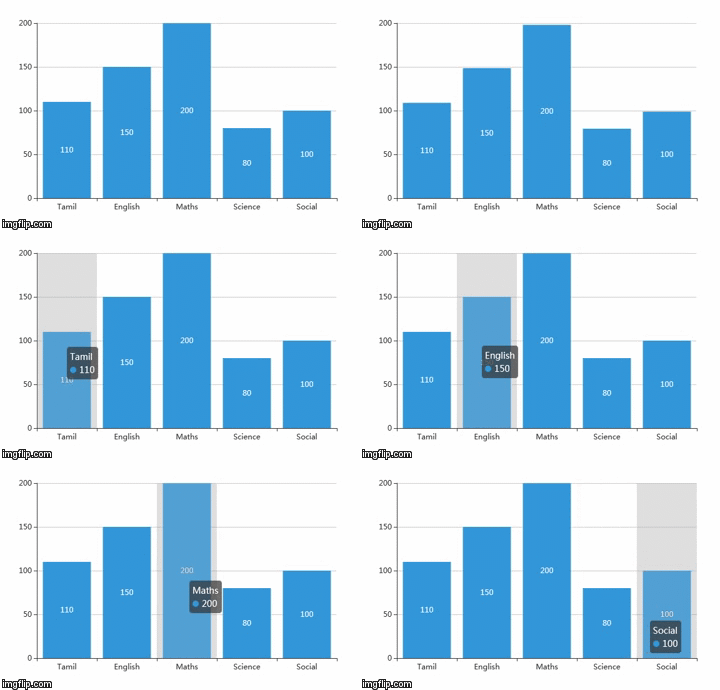
// Need to declare a div to render the chart
<div id="barChart" style="width: 600px;height:400px;"></div>
<script>
	var myChart = echarts.init(document.getElementById('barChart'));

	var options = {
		color: ['#3398DB'],
		title: {
			text: 'Bar Chart'
		},
		tooltip: {
			trigger: 'axis',
			axisPointer: {
				type: 'shadow'
			}
		},
		xAxis: {
			type: 'category',
			data: ['Tamil', 'English', 'Maths', 'Science', 'Social']
		},
		yAxis: {
			type: 'value'
		},
		series: [{
			data: [110, 150, 200, 80, 100],
			type: 'bar',
			label: {
				normal: {
					show: true,
					position: 'inside'
				}
			}
		}]
	};
	myChart.setOption(options);
</script>
Among the options very few are important, They are described below. These are the options which will be common for all chart type.
| Option | Object | Description |
|---|---|---|
| xAxis | xAxis.type(Type of axis) | The x axis in cartesian(rectangular) coordinate. Usually a single grid component can place at most 2 x axis, one on the bottom and another on the top. offset can be used to avoid overlap when you need to put more than two x axis. Default is 'category'. |
| xAxis.data | Provides the value range of the 'category' axis. | |
| yAxis | yAxis.type(Type of axis) | The y axis in cartesian(rectangular) coordinate. Usually a single grid component can place at most 2 y axis, one on the left and another on the right. offset can be used to avoid overlap when you need to put more than two y axis. Default is 'value'. |
| yAxis.data | If the data is not specified, it is auto collected from series.data | |
| series | series[i].data | The value that needs to be represented in the bar chart format. |
Line Chart
Broken line chart relates all the data points symbol by broken lines, which is used to show the trend of data changing. It could be used in both rectangular coordinate and polar coordinate.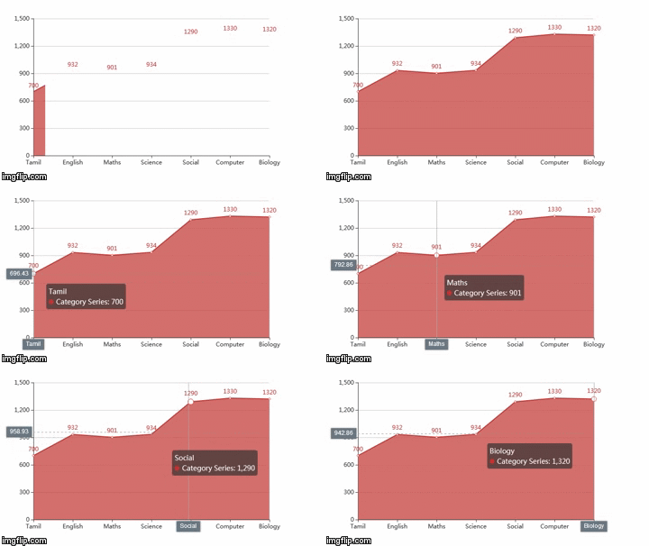
// Need to declare a div to render the chart
<div id="lineChart" style="width: 600px;height:400px;"></div>

<script>
	var myChart = echarts.init(document.getElementById('lineChart'));

	var option = {
		tooltip: {
			trigger: 'axis',
			axisPointer: {
				type: 'cross',
				label: {
					backgroundColor: '#6a7985'
				}
			}
		},
		xAxis: {
			type: 'category',
			boundaryGap: false,
			data: ['Tamil', 'English', 'Maths', 'Science', 'Social', 'Computer', 'Biology']
		},
		yAxis: {
			type: 'value'
		},
		series: [
			{
				name: 'Category Series',
				data: [700, 932, 901, 934, 1290, 1330, 1320],
				type: 'line',
				label: {
					normal: {
						show: true,
						position: 'top'
					}
				},
				areaStyle: {}
			}
		]
	};

	myChart.setOption(option);
</script>
Pie Chart
The pie chart is mainly used for showing proportion of different categories. Each arc length represents the proportion of data quantity.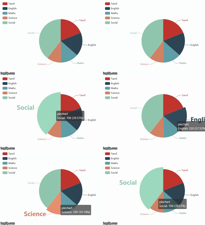
// Need to declare a div to render the chart
<div id="pieChart" style="width: 600px;height:400px;"></div>

<script>
	var myChart = echarts.init(document.getElementById('pieChart'));

	var option = {
		tooltip: {
			trigger: 'item',
			formatter: "{a} <br/>{b}: {c} ({d}%)"
		},
		legend: {
			orient: 'vertical',
			left: 'left',
			data: ['Tamil', 'English', 'Maths', 'Science', 'Social']
		},
		series: [
			{
				name: 'piechart',
				type: 'pie',
				radius: '55%',
				avoidLabelOverlap: true,
				label: {
					normal: {
						show: true,
						position: 'left'
					},
					emphasis: {
						show: true,
						textStyle: {
							fontSize: '30',
							fontWeight: 'bold'
						},
						shadowBlur: 10,
						shadowOffsetX: 0,
						shadowColor: 'rgba(0, 0, 0, 0.5)'
					}
				},
				labelLine: {
					normal: {
						show: true
					}
				},
				data: [
					{ value: 335, name: 'Tamil' },
					{ value: 310, name: 'English' },
					{ value: 234, name: 'Maths' },
					{ value: 190, name: 'Science' },
					{ value: 700, name: 'Social' }
				]
			}
		]
	};

	myChart.setOption(option);
</script>